
Carolien Molenaar
Read all my blogsAlmost every website uses forms. These can be contact forms, specific requests for a quotation, registration forms for a newsletter or a sample request. But the most common on a webshop are the forms encountered in an order process and in registering an account.
When a website customer enters the purchase process, you don’t want to lose this customer. Research shows that 60-80% of people leave the shopping cart before making a payment, so there is still a lot to be gained here. In this blogpost we’ll explain how to optimize your form to increase conversion in eight steps.
Tip 1: Keep it simple
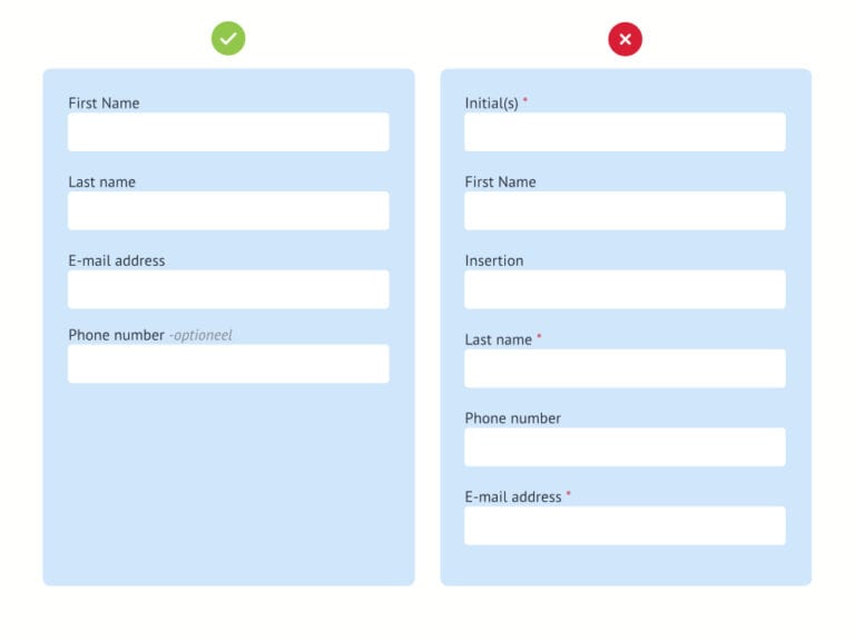
First, determine how much data you really need from the customer before creating your online form. Research among 40,000 contact forms showed that the conversion increased by 50% when the contact form was reduced from 4 to 3 fields.
People are critical when it comes to privacy on the internet. They prefer not to leave their data. For a simple question about a product, you do not need address information, so do not ask for it. Your customer will likely stop before completing the form. Research shows that 39% of of the account creation forms were abandoned when they asked for a phone number. The fear of being “harassed” by sellers is then greater than the information need. If you still want to include the question, make sure it is not a required field. After it became “optional” the loss was only 4%. When in doubt, remove the field.
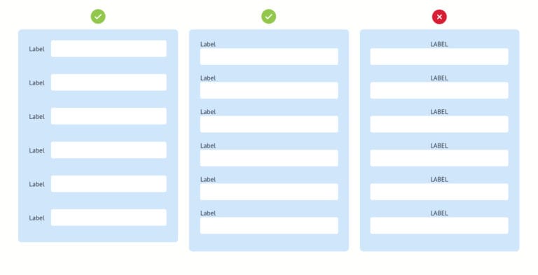
Tip 2: Focus on the form
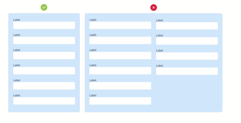
Use one column for your form fields. Research found that participants were able to complete a single-column form on average 15.4 seconds faster than a multi-column form. Elements around the form can also cause distraction. On more and more sites you will therefore even see that the entire menu bar has been removed.
Tip 3: Group or create steps
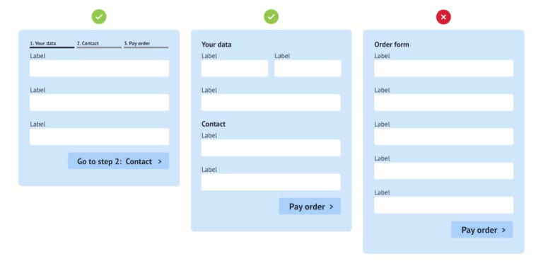
Compare the form with an interview. Go from general questions to more specific questions. The first questions will be answered with as little effort as possible. By doing this you trigger a psychological behavioral science principle rather than “commitment”. The customer is motivated to complete the action. A car insurance survey showed that conversion rates increased by 30% after they started with the simpler questions each user knows about themselves.
Grouping questions makes the forms seem less impressive and complicated. And you ensure a natural break in your form. For the somewhat complex forms, it is very suitable to break the form into steps. Make it clear which step of the process he is standing. By breaking up information into manageable “chunks” you ensure that your customers can process the information given better. You also create extra motivation for your customers to complete the form. Because they always fill in a step and go further in the form, you motivate them to complete the form. This is called the “endowed progress effect” and means that when you (artificially or not) create progress for a customer, he or she is more motivated to complete the action. Nobody wants to lose their progress.
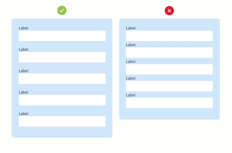
Tip 4: Use the right design
4.1 Live up to expectations
Research has shown that it is best to put the label of an input field at the top left of the input field. In this way you visually guide your customers through a form. By showing texts in capital letter (uppercase), more effort must be made to scan texts. We want to give the customer the feeling that it takes almost no energy.
4.2 Grouping between the fields.
Leave enough space between the fields and the next label. As a result, there is no misunderstanding of what exactly should be filled in where.
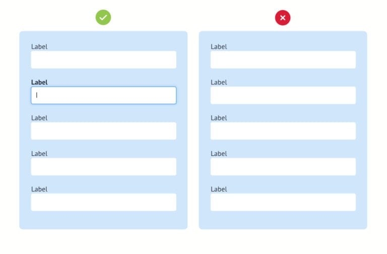
4.3 Show where the user is.
Highlight the field that the customer has selected. This keeps visitors focused.
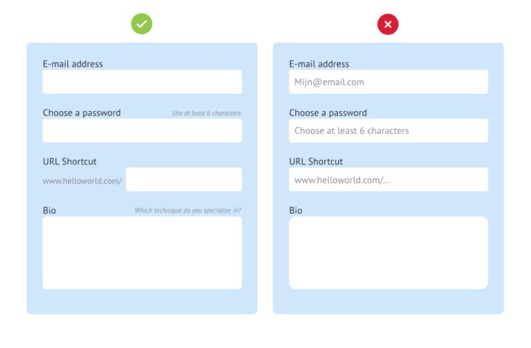
4.4 Only give instructions when necessary.
Do not overuse “placeholder” instructions, these will reduce conversion. The fields also seem to have already been filled in, so that the customer accidentally does not fill them in. Sometimes you need them, but put this description or example at the bottom or top of your input field so they don’t disappear once you enter the field. This ensures fewer errors. If the user is distracted for a moment and wants to continue entering the field, he must rely on his memory to see which information is expected.
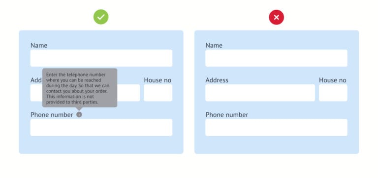
4.5 Provide explanations in the web form if it necessary.
Reassure your customer by placing an explanation under some fields. “We need this information because; We want to link you the closest person as your contact person”. Or using a tooltip “This is how you can make the calculation”, or an instruction what the customer can expect.
With the more complex questions, it is better to do it in a question form: How much do you want to borrow instead of the loan amount. This puts the word in a context, so that the customer understands more clearly what you want to know. It also sounds a lot more friendly.
4.6 Automatic replenishment.
Use the correct HTML tag with the standard label designations. Like; name, address, telephone number not only your customers but the browsers expect this. Google Chrome and Firefox have autocompletion options. This recognizes the label and easily facilitates the entry process.
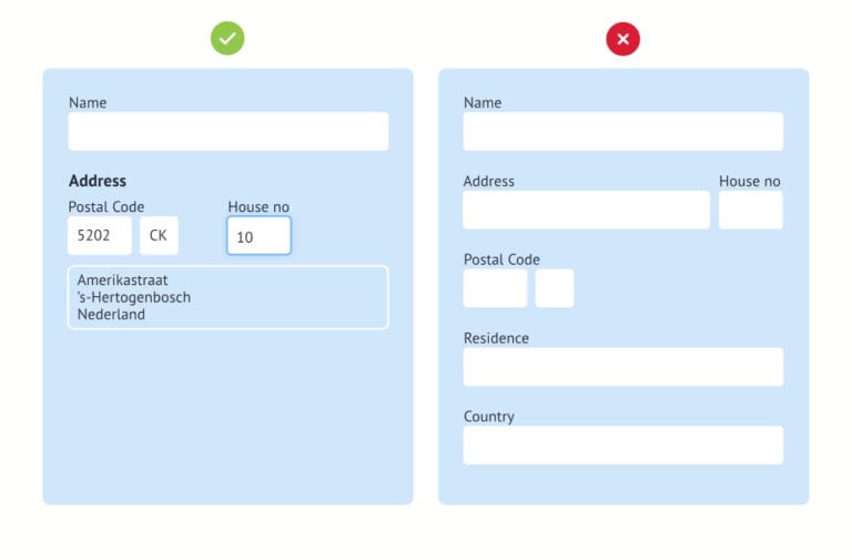
Use a zip code API. By only using zip code and house number, the system will complete the street name, city, province and country. You do not have to show these fields (tip 1). The customer will receive immediate feedback and fewer mistakes will be made. The result is that the products arrive at the right customer.
Tip 5: Be kind to your customer
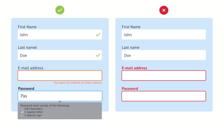
We still come across forms that only check if everything is correctly filled in after the submit button. You can also do this check immediately after the user has entered his details. This gives the customer immediate feedback and the effort for improvement is minimal. If the field is not filled in anyway, give the customer a friendly error massage then the well-known striking red color. After all, the customer didn’t do anything wrong. Always clearly indicate what went wrong when filling in the form and try to give your customer a hint where possible, so that he can complete the form successfully.
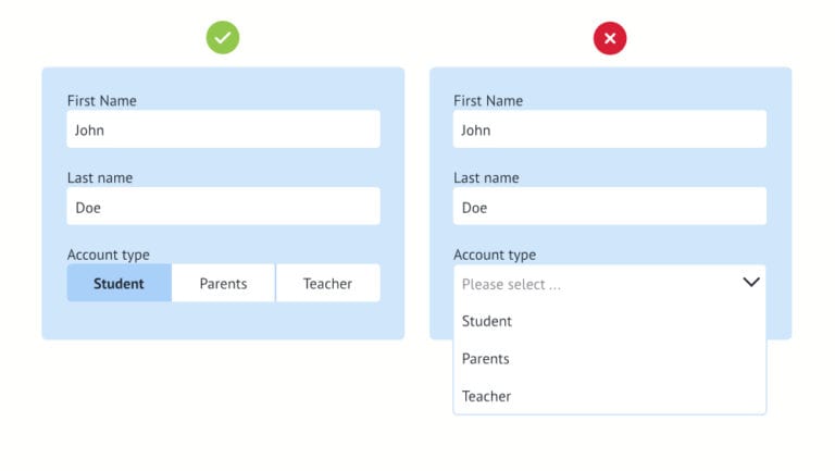
Tip 6: Avoid dropdowns
Dropdowns are often used immediately for multiple choice questions. But it is not visible how many answers are possible. The overview of answers is also minimal, so that your visitor quickly chooses the first choice that seems correct to him than the real match for his situation. The endless scrolling through a long list is also a nightmare for every visitor and especially on mobile. If you still want to use it, help the visitor with automatic completion.
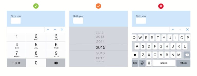
Tip 7: Optimize your form for mobile phones.
There is an increasing use of devices other than the desktop. The most common are the mobile sessions, so it is very important that the form is built responsive, but also has the correct input type. This allows different keyboards to be displayed. A good test whether your form is easy to fill in is to ‘keepie uppie’ a balloon with one hand, and fill in the form in your other hand with your mobile. You will soon see that a drop down with all birth year is less useful than a number keyboard. If you do use that, do not start with the current year because there will be few zero years that use your form.
Tip 8: Measuring is knowing
The user is the real test of the quality of your web form. With usability tests you can observe live whether the user succeeds in completing the form and check whether there are usability problems.
You can track the conversion percentage using Google Analytics. With these tools it is possible to gain insight into the drop-out percentage per step. This gives you a lot of valuable information about where you can optimize your forms.
In short…
Think carefully about the purpose of your form. Only ask for the essential information from your customer. Explain why you need this information with a friendly tone of voice. Use a logical structure of questions and use groupings as you would in a conversation. Take advantage of auto-completion so that the customer has to put in less effort and is more motivated to complete the form. And do the balloons test, then it should be all right with that conversion rate!

Receive our weekly blog by email?
Subscribe here:

