Aart Troost
Read all my blogs
Before leaving for Madrid to visit the SAP TechEd 2012 I composed my agenda and one of the lectures I planned to visit was ‘The UI Development Toolkit for HTML5’ by Tim Back.
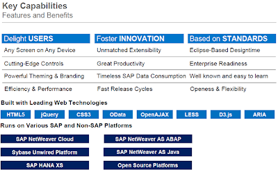
As a developer I’m getting more and more interested in FrontEnd development and user experience. This is why I wanted to know more about flexible design of web applications. I’ve been working with tools like Adobe Flex and Xcode, off course very nice tools to develop very solid and neat apps but I always felt limited on flexible layout as it comes to targeting multiple devices. What if a company wants an application that runs on a PC, laptop or any mobile device? Definitely a question SAP has asked themselves several times the last couple of years. The answer to this question has been the development of SAPUI5, that’s short for the UI Development Toolkit for HTML5. You can easily find a lot of blogs about how to use this toolkit to develop applications. The key features and benefits of this toolkit are summarized in the following image that Tim showed during the lecture.
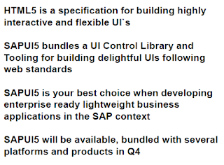
Later on in the lecture Tim talked about why and when to use HTML5/SAPUI5 and showed the next key takeaways.
After this he showed a web application in a web browser and he adjusted the size of the browser and the web page shown rendered nicely every time a certain screen size was reached. That really caught my attention and couple of weeks later back home in Holland I decided to have a look at how that works.
The first image of this blog shows a flexible design of a simple webpage that I wrote, it simply consists of one HTML page and a CSS file. With the use of media queries it is possible to target multiple devices by using their capabilities e.g. the window width and height and the orientation of the device.
Let’s have a look at how the webpage reacts to the different devices/screens it is shown on.
First I need to set the viewport to the same width as the width of the device that the page/app will be shown on. This way the webpage will be rendered to the same width as the width of de screen of the device. You can also set the height, scale etc. but for this example I will only use the width property.
On the web page I wanted the background of the tiles to react under certain conditions, for that I make use of media queries. These media queries will detect the screen size of the device the page is shown on and the appearance will be modified according to the details I have specified in the query.
At first the background of the tiles is the same as the background of the page, this is part of the default design in the CSS, but when I rotate the device (for this example on an ipad) the condition the next condition is met and the background color will be set to ‘red’.
If I visit the same page on my phone the next condition is met and the background color will be set to ‘green’.
Of course I’ve already seen a lot more rendering I could do when switching between different screen sizes and I really like this strength of HTML5 for building flexible applications for multiple devices.


