
Carolien Molenaar
Read all my blogsProduct pages are perhaps the most important pages in your webshop. Customers enter the shop through different channels on this page. Think of e-mail links, search engines such as google, comparison sites, inspirational sites such as Pinterest and Instagram or via shared content from friends. The initial goal is often not to purchase the product. If enough conviction and trust has been created, the customer will proceed to purchase. A perfect product page therefore does not exist. In this article we analyze the most common parts in a product page. And with that I show the anatomy of an effective product page.
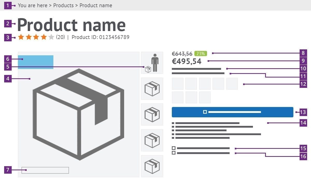
2. Product title
In the first 10 seconds, customers decide whether they stay on the site or not. Make sure the product title matches the title the customer saw before clicking on it. This creates trust. Google highly appreciates this title, which is good for your findability. So make sure that the most important keywords are present in the title. This title must also come back in your url to get a higher ranking from google.
1. Breadcrumb
Leads the customer through your page. be clear. Show where the current page is in the catalog hierarchy. And see if these also correspond to the menu names.
3. Review / Product totally sold
Customers prefer to buy a product that has already been purchased by other customers. Show this by, for example, how many people have preceded you and purchased this product.
It is even more powerful to have someone else tell how good they think this product is, it is often just as highly valued as a personal recommendation. Give this information even more strength by indicating how many responses were given to arrive at a final judgment.
4. Product image
An image often says more than 1000 words. Make sure your photo is as attractive as possible, and of high quality. This can be achieved by using a neutral background, but product photos can also be inspiring for customers by photographing in a natural environment. Make sure the product is at the center of the image with as little distraction as possible. However, consistency is key, so choosing this format means your should do it for all products. The customer now has an expectation when viewing another product. Also make sure that the file names of the images contain the important keywords and not for instance the name that the camera gives the photo.
5. “Banana for scale” your image
Sometimes a product image alone will not tell it’s size, for instance, a suitcase might look like hand-luggage while in reality it is a huge suitcase that stands to hip-height.. You can prevent this by showing a person (or a banana) with the product in proportion. The customer has a clear picture of what to expect.
6. Product label
Many customers might come directly to your product page through other channels. They will not immediately know that there is a promotion in circulation or that you specialize in ecologically or environmentally efficient products for instance. Let the label know what is currently going on with this product.
7. Brand
Many brands are linked to the user’s expectations. As a result, the customer knows what to expect and is not disappointed in the further process. Once you have disappointed the customer, it is difficult to get them back. If your product or web store has won certain quality marks or prizes, then show it! Each addition can help the conversion of your web store up a little.
8. Discount
If the Product is currently discounted, also give the retail price. If the discount percentage is high, also show this. This prevents them from being disappointed the next time customers have to pay the retail price. They now know that the product is good and see the discount as a stroke of luck.
9. Price
Don’t make the price a surprise. The price of the product must be clearly present on the product page. Use a different font, make it bold and give it a color. The full price or the estimated price must be known to the visitor at the earliest stage.
10. Stock
The customer wants to be in control of his order. He wants to know exactly what he gets (description and photos), how much he has to pay for it (price) and when it will be delivered. You should also give an indication of the stock. The customer will immediately know whether the desired quantity is in stock. Also state the expected delivery time. Sometimes things are out of stock, then communicate when you expect it again. Note that customers can be put off immediately when a lot of products are out-of-stock.
The fear of missing out, also called FOMO. Making customers “afraid” of missing the product works well in some cases. “5 places available” or “last model available” are triggers that create the fear of missing something. It is a fairly alternative way to encourage a purchase, but very effective in some industries.
11. Bonus rule
Some brands provide something extra with their product. This is often described in the product description. It would be a missed opportunity to not mention this extra more prominently. This can just pull the customer over the line which would lead to a purchase.
12. Variant options
If you are selling variants of a product (for instance different colours), I believe you should show all you have, and not hide anything. Do not hide alternatives behind a pull down button, but show it. Preferably also in a product image. The text “green” is a broad concept, but if you show a product photo with this color, the customer knows exactly what to expect.
13. Place in shopping cart button
Ultimately, we want the customer to buy this product. So make sure that this button attracts attention. It has also been proven that a striking button unwittingly invites you to click on it. So give the button a different and striking color. You can test this by standing a few meters behind your screen and then see where your attention is being drawn. If it is not the cart, you know it needs some more tweaking. You can also do an A / B test and see what yields more conversion.
If the product is currently out of stock, customers prefer not to order (yet). The customer wants exact certainty when they make a purchase. Give them an option for an e-mail notification when it is available again.
14. Unique Selling Points
If the customer still has doubts, these points can persuade the customer to make a purchase. The USP’s tell something about the shop or the product. This can be for instance about the warranty period, that customer service is now available until 9 p.m., that your products are handmade, freely shipped or for instance can be returned free of charge.
15. Save the product
If the customer is interrupted in his search. offer the possibility to save the product so that he can return later and continue his search. If the customer comes to your site, you can indicate that they have saved this or you can show the last viewed products.
16. Compare products
If you have many products with a minimal difference, the user will have to click back and forth between products during his search. During this page change you can quickly lose the customer. Give an option to be able to compare the specifications of the products he is interested in. This makes it a lot easier to make a choice.
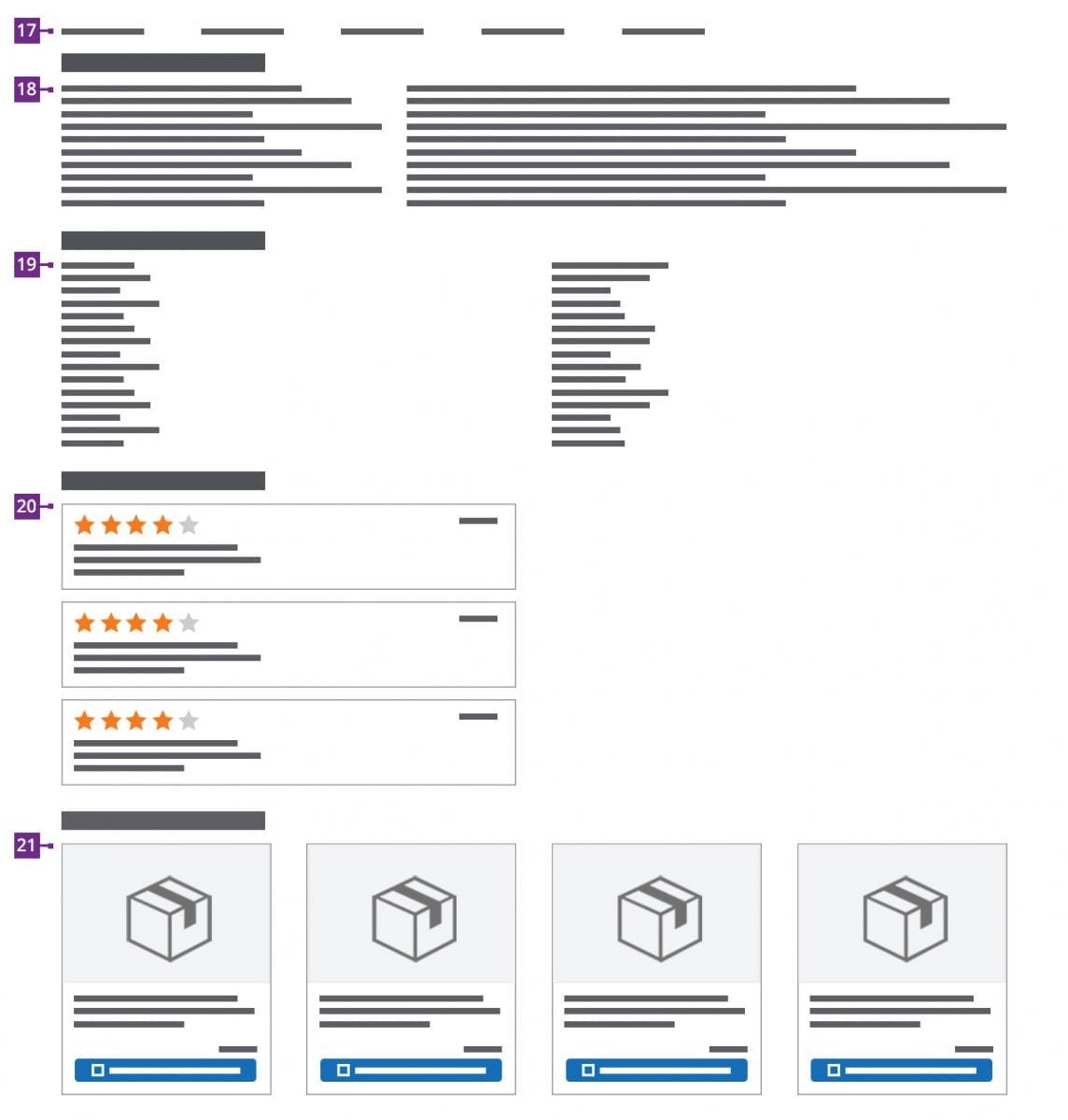
17. Small navigation
A lot of time and energy went into gathering valuable product information, so don’t hide this information behind a row of tabs! Use a small navigation so that the customer knows what to expect. Because they are linked, the customer does not have to scroll all the way to the specific part that he is interested in.
18. Product description
Try to split the text into a general product description and a detailed description. Be to the point and don’t just name the product characteristics. Make a link between property and the (user) benefit. Use about 300 – 350 words. Otherwise, most readers will drop out because it looks confusing.
19. Product specifications
The more information you state about a product, the smaller the chance that it will be returned. In the specifications you should state all characteristics of the product such as dimensions, colors, materials.
20. Assessments
You can tell the customer why you think he should buy the product, but is more powerful to have customers recommend the product. Show an overview of the ratings given. How many are there, show the distribution of the given stars. But also who gave the review. Try to encourage people to add a description. This information is often more valuable than the stars themselves.
21. Cross-selling
Scenario: When buying a camera you probably also want a protective cover, which is often at the bottom of the page. You can also suggest these products when a customer places the product in the shopping basket, which gives a pop-up with a cross-selling product from which you lead the customer to an additional purchase. This way the customer can complete their order with handy accessories.
21. Upselling
There is a good chance that the product found does not fully meet the needs of your visitor, so you usually also have several variants in the range. Therefore always offers some alternatives for the desired product. Help the customer as well as possible by displaying the most relevant options. This also increases your turnover because they still purchase a product.

Receive our weekly blog by email?
Subscribe here:

