
Sandor van der Neut
Read all my blogsUsing SAP UI5 Web Components with ReactJS
Adopt the qualities of SAP Fiori UX in other UI technologies, 01 January 2020
The UI5 Web Components are the new offering of UI5 to provide a set of reusable UI elements to you. These elements can be used for your static web sites or for web applications using any web framework of your choice with a minimalistic footprint. They allow you to create a consistent user experience aligned with the SAP Fiori Design Guidelines and incorporate the Fiori 3 design. This means that with UI5 Web Components you can easily adopt the qualities of SAP Fiori UX in other UI technologies such as React, Angular and Vue.
As a developer I’m always interested in keeping myself up to date with the latest developments in our field. It is from that perspective that I came to know about UI5 Web Components and the desire to dive deeper into this subject. In this blog I try to achieve this by building a simple commercial product overview application using the React framework combined with UI5 Web Components for React.
But before we start let’s first do some introductions.
ReactJS
ReactJS is an open-source JavaScript library which is used for building user interfaces specifically for single page applications. It’s used for handling the view layer for web and mobile apps. React also allows you to create reusable UI components. React was first created by Jordan Walke, a software engineer working for Facebook. React was first deployed on Facebook’s newsfeed in 2011 and on Instagram.com in 2012. React allows developers to create large web applications which can change data, without reloading the page. The main purpose of React is to be fast, scalable, and simple.
SAPUI5 versus React
SAPUI5 and React are both code-centric JavaScript frameworks but there are some differences. If we ignore the fact that the first one is created by SAP and the latter by Facebook then the biggest difference is that SAPUI5 comes with a lot of “out of the box” pre-built components. React on the other hand doesn’t have any pre-built components in its core libraries and expects the applications look and feel to be created by the programmer. This means React is more flexible in its look and feel, but also more complicated because some UX design and CSS is required.
Preparation
Now that the introductions are done it is time to prepare for the real thing. Before I started working on my own application I followed this very nice tutorial Build a Single Page Application using UI5 Web Components for React on the SAP developers website. In this tutorial you learn for example how to create a new React application and how to connect the application with UI5 Web Components for React. It will also explain how to create and style the different UI components. This was a great benefit for me and it helped me a lot when building my own application. The end result, after completing the tutorial, was rather nice and gives you an example of what can be done by UI5 Web Components.
My Mission
With the basics now under my belt I was feeling ready to build my own application. Because I didn’t want to start totally from scratch I took a React application I made before on SAP Cloud Platform using the SAP Web IDE. It was one of the first React applications I have ever built. It is a simple commercial product overview, but very suitable to refactor using UI5 Web Components.
Getting started
Before you can start there are first some prerequisites you have to take into account. ui5-webcomponents-react only can be used when the following requirements are met:
- Packages React and React-DOM should be version **16.8.0 or higher**
- Node.js should be version 12 or later
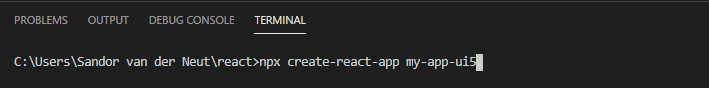
When the requirements are met the first thing you really need to have is a React App. You can create one easily by running the create-react-app command from the terminal.
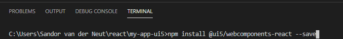
Obviously we want to use in our application the packages which are available in the ui5-webcomponents-react solution. To be able to use the basic components we have to install the npm module @ui5/webcomponents-react in the root directory of our newly created application.
Besides the @ui5/webcomponents-react package the following packages are available as well and they can be installed additionally when necessary.
- @ui5/webcomponents-react – Fiori 3 Components
- @ui5/webcomponents-react-charts – Fiori Charts
- @ui5/webcomponents-react-base – Utils
The last thing that needs to be done, to be able to use ui5-webcomponents-react, is that you have to wrap your application’s root component into the ThemeProvider component.
In my application it was done in this way:
[javascript]
import React from "react";
import { MyApp } from "./MyApp";
import { ThemeProvider } from "@ui5/webcomponents-react/lib/ThemeProvider";
import { HashRouter } from "react-router-dom";
function App() {
return (
<HashRouter>
<ThemeProvider withToastContainer>
<MyApp />
</ThemeProvider>
</HashRouter>
);
}
export default App;
[/javascript]
Building the application
With the basic application in place it is time to build my product overview application with UI5 Web components and a good place to start is the Storybook. In the Storybook you find a nice overview of the different components that can be used and what parameters can be used. You can also check the UI5 Web Components Playground.
Because I wanted to have a fancy looking application I decide to have a nice menu bar at the top of my application. After some searching I found out that the ShellBar component will do nicely.
The first thing you do is import the desired components in your app. This can be done as follows:
[javascript]
import { ShellBar, ShellBarItem } from "@ui5/webcomponents-react";
[/javascript]
After that the ShellBar component is available and was added to my application in the following way
[javascript]
<ShellBar logo={"LogoAcorel.png"} onLogoClick={handleLogoClick} onProfileClick={handleProfileClick} profile={"profilePicture.jpg"} primaryTitle={"Powered by UI5 Web Components"}>
<ShellBarItem src="sap-icon://add" text="Add" />
</ShellBar>
[/javascript]
In the ShellBar we added a logo, a title and a profile picture. Additionally I added two event handler functions which might come in handy later.
When running the application this was the result.

The following step was to show the actual product data on the screen. For the retrieval of the data I used the same code and OData service as I used in the original application I mentioned above and it will not be discussed in detail here.
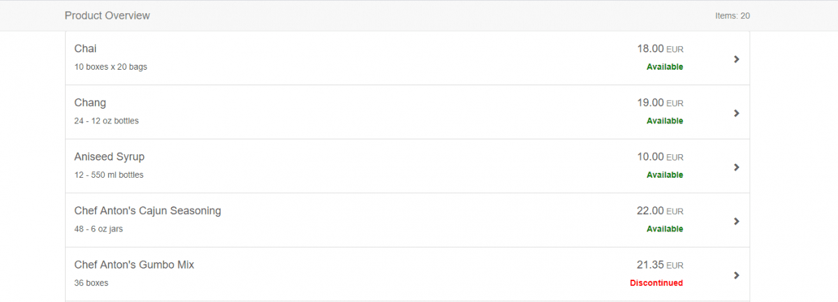
For presenting the data the Card component seemed a good place to start for me and to be able to handle multiple lines I placed a List component in the Card component body. In the List component body I placed a function GetListItems which will return an array of ListItem components. As can be seen in the code examples below.
The Card Component with the embedded List components
[javascript]
<FlexBox justifyContent={FlexBoxJustifyContent.Center} wrap={FlexBoxWrap.Wrap} >
<Card heading="Product overview" status={`Number of items ${Products.length}`} avatar="sap-icon://factory" style={{ width: "900px", …spacing.sapUiContentPadding }} headerInteractive onHeaderClick={handleHeaderClick} >
<List>
{getListItems()}
</List>
</Card>
</FlexBox>
[/javascript]
The getListItems functions that maps the Product array from the OData service to an array of StandardListItems
[javascript]
const getListItems = () => {
if (Loaded === true) {
var productListBoxes = Products.map(function (row) {
return (
<ListItem row={row} key={row.ProductName} />
);
})
}
return productListBoxes;
};
[/javascript]
The ListItem constructor that creates the actual UI5 Web Component
[javascript]
function ListItem(props) {
return (
<StandardListItem info={props.row.Discontinued ? "Discontinued" : "Available"} icon="sap-icon://nutrition-activity" description={props.row.QuantityPerUnit} infoState={props.row.Discontinued ? ValueState.Error : ValueState.Success} >
{props.row.ProductName}
</StandardListItem>
);
}
[/javascript]
With all the coding in place it’s time to take a look at the end result! As you can see below it turned out actually quite nice. I am happy to say that without too much effort I successfully have rebuilt my Product Overview application using UI5 Web Components.
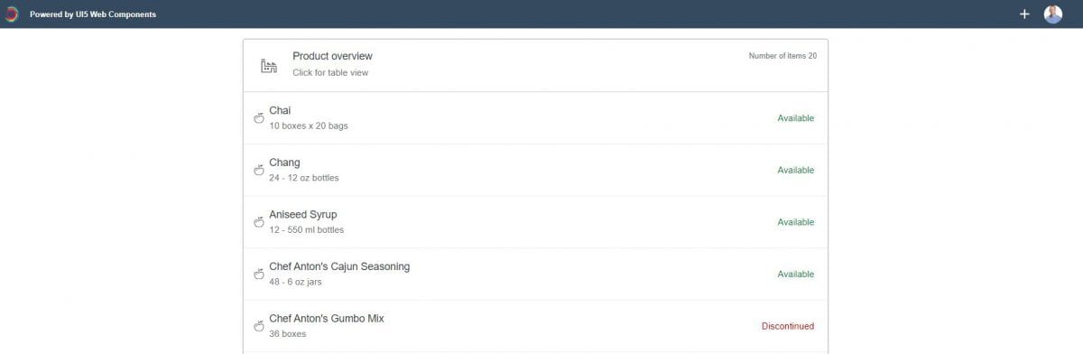
Taking it to the next level 1 – Toggle Views
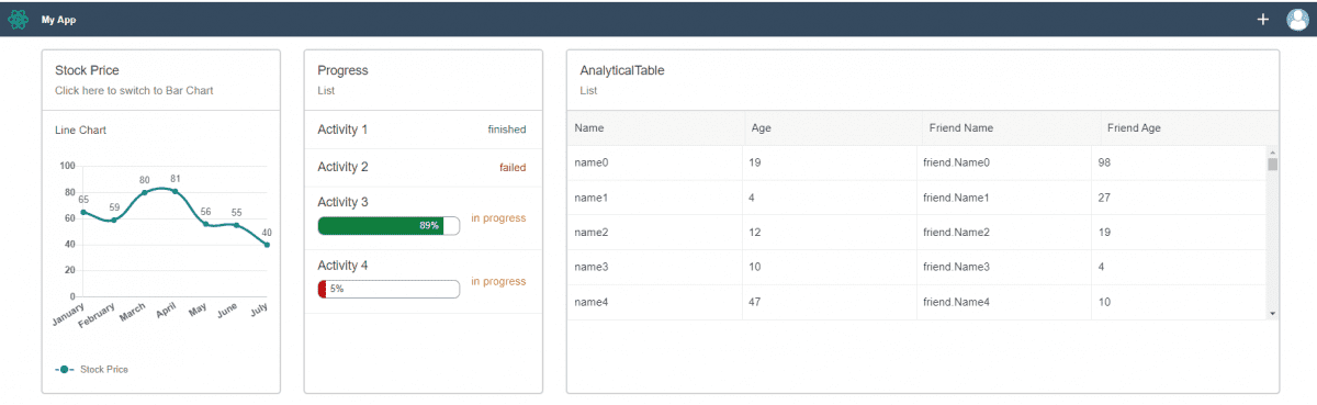
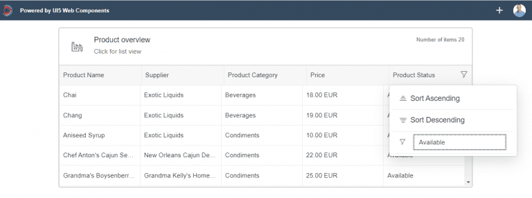
I still felt a bit dissatisfied with the application so I decided to add some extra functionality. Because the StandardListItem component has only limited space to place all the product information, I also implemented the Analytical Table Component which can present the data column based.
I started with adding a new state to my application using the useState functionality
[javascript]
import React, { useState, useEffect } from "react";
const [toggleView, setToggleView] = useState("list");
[/javascript]
When the header is clicked the toggleView state is being changed.
[javascript]
const handleHeaderClick = () => {
if (toggleView === "list") {
setToggleView("table");
} else {
setToggleView("list");
}
};
[/javascript]
And in the body of my Card component we will show alternating the List component or the Analytical table based on this same toggleView state.
[javascript]
{toggleView === "list" ? (
<List>
{getListItems()}
</List>
) : (
<AnalyticalTable filterable={true} data={getTableData()} columns={tableColumns} visibleRows={5} />
)}
[/javascript]
The result is that we now have a more detailed overview with the product information available! And the UI5 Analytical table component provides us with out of the box filtering and sorting functionality.
Taking it to the next level 2 – Theming
By default UI5 Web Components come with the SAP Quartz, a.k.a. Fiori 3 (technical name: sap_fiori_3) theme. But by importing an additional module you also get support for the following themes:
• SAP Belize (sap_belize)
• SAP Belize High Contrast Black (sap_belize_hcb)
I wanted my application to be able to support multiple themes, so I imported the following components to my JSX-script.
[javascript]
import "@ui5/webcomponents/dist/json-imports/Themes.js";
import { setTheme } from "@ui5/webcomponents-base/dist/config/Theme.js";
[/javascript]
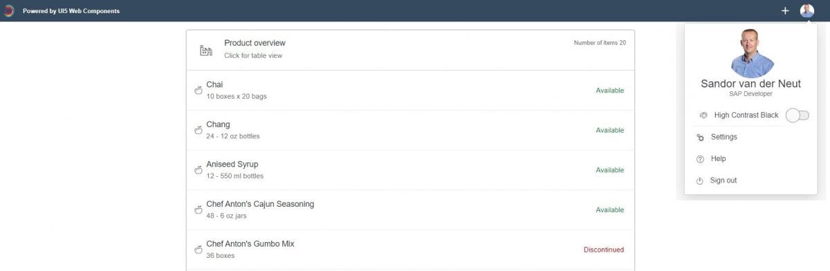
And to make it all a lot fancier I added a User Profile screen, using the UI5 Popover component, where you can switch between the default Fiori 3 theme and the High Contrast Black theme.
I have to admit that I borrowed this idea from this excellent blog: UI5 Web Components: a step-by-step demo application. But the results looks very nice and it is another example of the power of the prebuilt UI5 components.
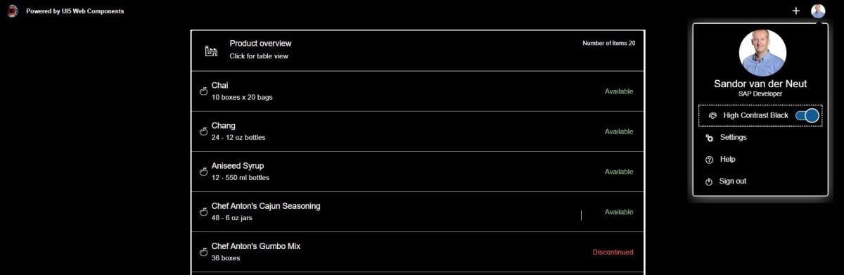
When the ‘High Contrast Black’ switch is pressed a function is being triggered that calls the imported setTheme function which takes care of the theme switch.
[javascript]
const handleThemeSwitch = () => {
setTheme(toggleSwitch ? "sap_belize_hcb" : "sap_fiori_3");
}
[/javascript]
The result is that we have an application that can now switch between two themes. An example of the High Contrast Black them can be seen below.
Conclusion
UI5 Web components provides an easy to implement library with reusable UI elements which can be used in any web framework of your choice. By using the UI5 Web components you are able to create a consistent user experience aligned with the SAP Fiori Design Guidelines.
I personally found UI5 Web components easy to work with and the documentation is very good. By using the pre-built components you are able to create a nice looking application in a relative short time. However by using the UI5 components you have to accept the restrictions that these components force upon you.
I hope you enjoyed reading this blog and gave you some insight in the possibilities of UI5 Web Components, I certainly enjoyed making it. If you have any questions feel free to contact me at sandor.van.der.neut@acorel.nl
Receive our weekly blog by email?
Subscribe here:

