
Joost Goudriaan
Read all my blogsIf you have checked out my previous blog posts, you already know that I like to share my personal experiences with the SAP CX solution that I use on a daily basis, SAP Sales Cloud.
At Acorel we introduced SAP Sales Cloud (SAP Cloud for Customer, back in the day) for our sales team in 2014. Since then the solution has been growing in functionality enormously and the User Interface (UI) has gotten some upgrades too.
In the August release of this year (2008) the new UI theme “Saphira” was first introduced as beta* and it really got my attention as it looked very fresh and above all very user friendly. With the latest November release (2011) some parts of the “Saphira” theme are now delivered standard and I took some for a test drive.
Things I really like about “Saphira”
- Freshness
Ok, I am visually set; always have been, always will be. And I really like the fresh color scheme that is used in this new “Saphira” theme. It is just very relaxing for the eyes 🙂
- Things that matter, matter!
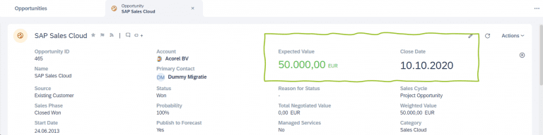
Not all information is equally important, and SAP gets this by making certain information just stand out a bit more. By using a larger text or even colors, you directly know what you need to know!
- Visualization
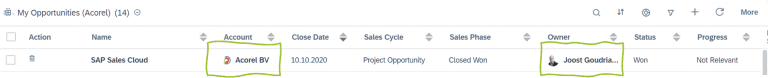
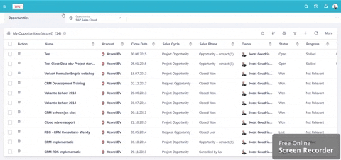
As already mentioned at the first bullet I am visually set, so for me the fact that the logo of the customer or face of the contact person or colleague is shown in the different list views is fantastic. It really helps me in finding the right opportunity for example in a list view.
- Auto-hide menu
A super simple feature with a big impact. I only want to use the menu when I need it, so in the previous theme I always had to hide the menu manually. Now in the new theme there is an auto-hide menu, whoop-whoop! Sounds super simple, and to be honest it is, but just think about the number of clicks it will save me 🙂
A thingy that can be (and will be) improved
With every new thing, there are always things you don’t like or think they could do better. The one I found so far is that the “Saphira” theme is not (yet?) supported on your smartphone. It will fall back to the standard Fiori theme. From a user perspective it is always nicer when an application has the same look & feel no matter the device you are using to access it. SAP states that it’s a ‘current limitation’ which luckily implies that they will smooth it out in a future release.
A thing that I need to get used to
The legend of the font styles and colors has changed in the new “Saphira” theme and I think it is for the better, but for now I really need to get used to it.
In our previous theme (standard Fiori) the ‘Fonts legend’ is:
| Font style/color | What does it do |
| Black | Mweh, not that much. It is just plain text |
| Black (bold) | Well, it isn’t used |
| Blue | It is clickable and navigates you to the details of that object |
| Blue (phone number) | It is clickable and (if set up) it will call the number |
| Blue (email address) | It is clickable and it will open a New email with the clicked address in the To in your email application |
| Blue (address) | It is clickable and it will open (for me at least) Google Maps and will show you the address on there |
In the new “Saphira” theme it is a bit different:
| Font style/color | What does it do |
| Black | Mweh, not that much. It is just plain text |
| Black (bold) | It is clickable and navigates you to the details of that object |
| Blue | Well, it isn’t used anymore |
| Blue (phone number) | It is clickable and (if set up) it will call the number |
| Blue (email address) | It is clickable and it will open a New email with the clicked address in the To in your email application |
| Blue (address) | It is clickable and it will open (for me at least) Google Maps and will show you the address on there |
The fact that some blue is exchanged for black and bold is the thing I need to get used to. I think it is because the blue just stands out more for me than black and bold. (I only have been test driving it for a couple of hours now, so maybe it will grow on me 😉)
Conclusion
When you come back at the dealer after you have test driven a car, the sales rep will ask you if you enjoyed the ride and if you are interested in buying the car. In this case my answer would be ‘definitely!’ I really like the clean UI, the pictures and the intuitiveness.
So, I am really looking forward to the next releases, where SAP will make more “Saphira” parts standard available.
*by the way, how old were you when you figured out that BETA stands for Break it Early Test Application?
(I was 42…#mindblown)

Receive our weekly blog by email?
Subscribe here:

